Bookstore wins a hubbie
Almost a year ago now the BCIT Bookstore let Web Services know that the e-commerce application they used to manage their online sales was upgrading and asked if we’d like to help skin the new site. The department was pretty busy at the time and my manager said we didn’t have time to help out but put them in contact with me so I could direct them to the style guide and technical guidelines.
I had a look at the application and decided we could do better than that so I asked my manager if I could do some follow up and he said it was okay as long as it didn’t interfere with my other work.
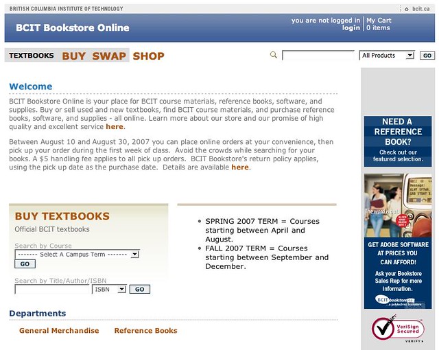
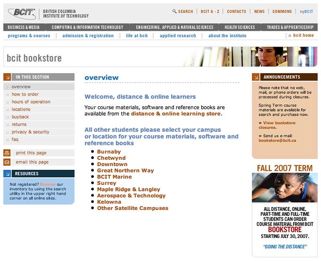
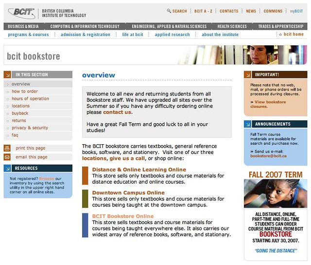
I met with the Bookstore intending only to talk about the web app but ended up talking about their static store front just as much. Because of the way their inventory and software work they have not one but three online stores and they have trouble communicating the difference to their customers. They also felt like some of their most important information, like their return policy, was buried.
Skinning the e-commerce sites was relatively easy. The new version of the application was set up logically with good CSS tags and lots of includes. Not only that, the default layout was very easy to transform into the existing template I wanted to mimic.
For the static store front I made some changes to the left navigation based on the most desired pages, created three clear calls to action, placed the catch all action at the bottom of the list instead of the top of the list of options, and separated the two unrelated messages contained in the single page block on the right.
I worked off the side of my desk for a few months on it, meeting with the bookstore a few times, and when I was done they were happy enough with the results to email my manager and thank me in the Campus Update newsletter!
My manger called me into his office to talk about it and I thought, “Uh-oh, what if he’s upset I spent so much time working on this?” But I worried unnecessarily since he proceeded to tell me how it was good interaction design :)
Campus Hub, the third party company who hosts the actual stores liked it so much they’ve been directing people who want to skin their stores to talk to me for advice, and to top it all off, they awarded the store with a “Hubbie” for usability.


