
Print Styles Are Responsive Design
Print styles are the original responsive designs. Using media queries we pare down the content, focus on readability, and design with different device capabilities in mind but when was the last time you took a good look at your print styles?
Yes, people still print web pages. Extrapolating from these numbers about 10,000 pages are printed from bcit.ca every month. The print experience is an important part of a good site and relying on your screen styles to print properly is foolish:
- Background images and colours are stripped.
- Web fonts might turn into gibberish or not print at all.
- Layout bugs can cause missing content.
- You’re ignoring the fact that paper is a totally different medium!
Printing can really screw up a web page.
Avoid common problems
One of the most common problems I saw when doing my survey of print styles was white text printing on a white page. To save ink the browsers will strip all background colours and background images before printing so in your print style sheet be sure to over-ride any light coloured fonts. I also add a thin border to elements where the background colour is used on the screen to differentiate the content and reinforce the grid.
There’s a variety of common layout bugs everything from floats to absolute, fixed, fixed-width, and semi-opaque elements can get cut off, misplaced, or disappeared entirely especially when the element flows across a page break. If it’s too wide some browsers will shrink your page until it fits and others will crop it. Where possible do away with your layout and make your content linear and fluid.
Web fonts introduce a new quandary to the world of print styles. FireFox and Chrome don’t print web fonts. Have you ever seen a site with the word-spacing, line-height, and font-size picked for one font displaying its fallback font? It’s not usually a pretty picture. I recommend over-riding web fonts in favour of a common font, especially for body copy.
Focus on content and save paper
While you’re stripping your web fonts out, consider the readability of the rest of your typography. How does it look printed? If your page is being printed chances are someone is going to spend some time reading it - more time than they’d spend on your site. Do what you can to make that pleasant.
Layout elements like headers, footers, banners, ads, and menus distract from the information the user is trying consume, are un-usable on a printed page, and take up extra paper. It’s very common to remove these elements when printing. A three-column page layout doesn’t look so bad on one short page but if your site has a substantial amount of content those columns will likely be empty from the second page onward leaving large fields of empty space or worse your columns will spread onto a second page when your content only filled the first. What’s your user going to do with that printed navigation menu anyway - click on it? How does that logo in your header look in black and white? Removing layout elements makes it much easier to make your remaining content fluid to avoid common print bugs and fit the page. Think about a better way to communicate the other information - more on this in a bit.
Provide a better print experience
Print doesn’t work like a web page. The user can’t interact with it anymore all they can do is read it. Consider what that means for content on your page that you can’t normally see.
There’s some pretty fancy CSS tricks you can use to add the URL of links to the page in brackets after the link. I think I’ve seen it done best by the HTML5 boilerplate but I prefer to add footnotes with javascript. This is much less disruptive for readers. Either way make sure you consider how you’ll handle links that aren’t URLs: javascript hooks, in page anchors, mailto or tel. These same tricks can be applied to abbreviation titles and other attributes.
Not all interactive content can be exposed. There’s no CSS trick to print a video or Flash file and frequently this missing content will just leave a big white gap in your page. Your options are pretty much: hide it, provide a place holder, include a short summary, or include a full transcript. I’ll leave the method up to you.
For content revealed by javascript my suggestion is to do your best to print the content that the user sees. If they’ve toggled open two out of ten of your FAQs, just print the full text of those two and leave the others closed. I’ve seen several sites which don’t include their global styles when printing but forget to include the styles their pages are dependant on in print stylesheets (this is most common with javascript). I can only imagine how frustrating that would be to a user.
Provide a better brand experience
The most basic print styles make a page more readable at the expense of some of its character but we don’t just have to take away. You can include a print specific header and footer hidden in your HTML or add them later with javascript. This gives you a chance to include a black and white version of your logo and any other brand cues you feel are important. You might already be using a grid to maintain visual consistency between desktop and mobile, here’s your chance to do it in print too.
Other information you might consider adding in a print header or footer is: way-finding clues like a section or category name, general contact information like a 1-800 number (more useful than a link to a contact us page), and a short URL to help the user get back to that page. Some sites even include a QR code but use your best judgement.
Speed up your pages
It boggles my mind that browsers will still delay rendering a page until it has loaded a style sheet with the media type of print. #seriously #testyours. This article on Browser Performance Problem with CSS “print” Media Type outlines the problem really well.
If you’re just trying to avoid the extra http request and your print styles are very small you can always just add them into your main CSS file.
@media screen {
/* screen styles here */
}
@media print {
/* print styles here */
}
Otherwise you can look at techniques to load them asynchronously. There’s a couple ways to do this.
Seeing it in action
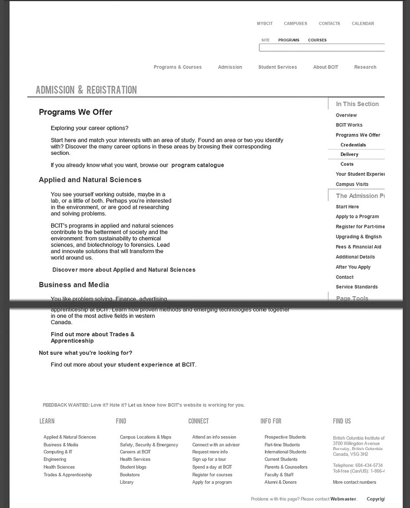
On the left is our site on a screen, on the right how it looks formatted for print. In the middle, without any print styles, you can see it goes boom:
- The white logo is invisible
- Chrome decides to crop rather than shrink the site to fit making it obvious things are not right.
- Our grid falls apart without the background images.* There are large gaps where the videos are.
- The only useful information in the footer is pushed off screen by a sea of links.
Did you see what happens to the Bebas font we used on our section names? You caught me, this is a screen cap not a scan of a printed page. Bebas wouldn’t actually print and the 6 pixels of word spacing we have to apply to it to get it to play nice looks kind of silly on Arial Narrow.
Our print style sheet is loaded asynchronously after the rest of the page and at the same time I run functions to add a print header, print footer and the URLs of the links on the page as footnotes.
The screen header, sidebars, banners, and footer are hidden from display and I force the main content to become fluid again. Other than that the actual body of the page needs only minor work because these styles are layered over our global styles. I darken up some text, remove videos and Flash elements, and on pages which don’t already have outdented headings I outdent the headings. If this page had javascript elements everything would print as the user left it before printing.
The print header includes a black and white version of our logo which prints nice and crisp compared to a colour one and uses a few thin lines to re-establish the grid creating a visual tie back the way the website looks on a monitor. It also includes the name of which section of the site the page is from and a shortened URL to return to the page.
The footnote function is complex enough to re-use a footnote if there are multiple links to the same page, provided a shortened URL if it’s an internal link, include fallback text for javascript links, and skip footnoting an email address if the address itself is all that’s included between the anchor tags (our style guide mandates this but the odd one slips through the cracks).
The very basic footer was a victim of time constraints. We couldn’t include our 1-800 number on all pages because it’s specific to Student Enrolment and wouldn’t be appropriate on business services pages, for example.
Code tips
If you have a large constantly evolving site I recommend making your global style sheets apply to both screen and print. It saves you the trouble of keeping two sets of stylesheets up to date when changes are made. That leaves you the task of over-riding some of the screen styles in the print style sheet. This will be much easier if you’re already avoiding IDs for styling. If you’re not it seems to be acceptable to sprinkle your print styles with !important declarations.
“Print preview lied to me.” - @hicksdesign
Test until it’s perfect in print preview. Then test until it’s perfect when you print to PDF. Then test until it’s perfect when you print it out on paper. There is no other way to be sure you’ve got it right.