
The MDN Redesign “Behind the Scenes”
This article was originally published on Mozilla’s Hacks Blog.
Kuma, the code that produces the MDN site, is a weird mix of the old and the new. MDN turned ten in 2015 and there’s still code and content around from those very first days. When I sat down to start coding the current redesign, the first thing I did was remove the last few traces of the last redesign. In contrast, we have a cutting-edge audience: 92% of our users have a browser with CSS grid support! We enabled http2, and 98% of our users have seen benefits from that.
One of the ways we deal with old code in kuma is with the campsite rule: Always leave your campsite better than you found it. A redesign touches a lot of files, and this was a great opportunity to clean up and refactor — at least until the deadline started getting close.
A redesign is also a great time to change stuff you’re afraid of breaking. People are more understanding of you working the bugs out of something new than breaking something that’s worked for years. I removed 640 lines of stale code during the redesign. (And if I broke a six-year-old XPCOM tutorial you use daily by removing the custom list-style-type, please file a bug!)
One website with two looks
Rather than working on the CSS for the redesign in a separate “redesign” folder, we duplicated all the files and added “-old” to the file name of the old files, which means that all of our redesign work is happening in the “official” files. This preserves the git history and means we don’t have to move anything around after launch. Once we’re happy with the code, we can delete the “-old” files with confidence.
To serve the new styles to our beta testers and the “-old” ones to everyone else, we use Django Waffle. Waffle can also be used to serve different content but because there’s a strong separation of presentation and content on MDN, we’ve made very few changes to the HTML.
Bugs our beta testers found
MDN is huge, and we can’t test every page in every locale. We’re really lucky to have active beta testers. :) Some of the biggest things they turned up for us were:
Highlighting
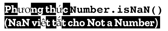
We started out by replicating Mozilla’s brand “highlight” effect by using the Zilla Slab Highlight font, but we abandoned that pretty quickly when problems turned up in many of our locales and when used in combination with inline code.
The current approach puts a full-width black background on h3 and h4 headings by default, and then some JavaScript runs to add a <span> tag so that the black background hugs the heading text. Progressive enhancement at work.
We went back and forth about this for a while, wondering if the JavaScript and extra <span> was worth the effort. But we stuck with it because it makes the h3 and h4 headings much easier to spot when scanning the page.
What’s Taiwanese for Slab Serif?

Previously we used Open Sans as our heading text. With the redesign, we switched to Zilla Slab. Open Sans was thin and an average height for a font. It didn’t look out of place next to the system fallbacks for Chinese or Japanese characters.
Zilla is big and thick, and we started getting feedback about the contrast with these system fallbacks. Additionally, the character set for Zilla is European Latin only at the moment, so Vietnamese, which uses Latin characters plus a couple Latin characters not used in Europe, displayed font fallbacks in the middles of words.
To address both these problems, we implemented a system that allowed us to override the site fonts on a per-locale basis.
Contrast
We received many complaints about the old design’s low-contrast display. We went a bit too far the other way with this design and received complaints about the high contrast. We’ve toned it down to the ever-popular #333 now.
What’s next
We’re moving on from this to make specific improvements to the article pages:
- Putting code samples high on the page; our hard-working writers and volunteers are doing this, one page at a time.
- A better approach to readable line-lengths and wide code examples, inspired by the Hacks Blog theme.
- Compatibility tables that display desktop and mobile data side by side.
- Code samples you can experiment with in the page.
Who is “we”?
The MDN dev team is:
- Stephanie Hobson, me, CSS-Pre-Pre-Processor
- Schalk Neethling, who reviewed each of my 30+ pull requests in ALL THE BROWSERS, sometimes multiple times
- John Whitlock, who did the awesome locale fallbacks
- Ryan Johnson, who always asks “Why not?” when John and I say things can’t be done.
We blog sporadically on the Mozilla Marketing Engineering & Operations blog.
You should also read this blog post by our Product Manager, Kadir Topal, about The Future of MDN.